I’ve struggled to animate form labels and placeholders. Previous solutions didn’t work, because I wasn’t able to change the label’s position inside HTML. Previous solutions I’ve seen are all required labels or another element to be put below the input field. But I was adding CSS to HubSpot forms, where we can’t change their HTML.
Then I saw new available :focus-within pseudo-class, that is actually can select a parent element, the option that never before existed in CSS. So here’s my code, I’m using both placeholders and labels to show the labels as a tip.
Since we’ll be using absolute position, we need to make input surrounded element position: relative.
.hs-form-field {
	position: relative;
}
Then manipulate the label, show it only on focus with animation:
/* label animation */
.hs-form-field > label {
position: absolute;
top: 0;
opacity: 0;
transition: 180ms ease-out 200ms;
}
.hs-form-field:focus-within > label {
opacity: 1;
top: -1rem;
transition: 200ms ease-in;
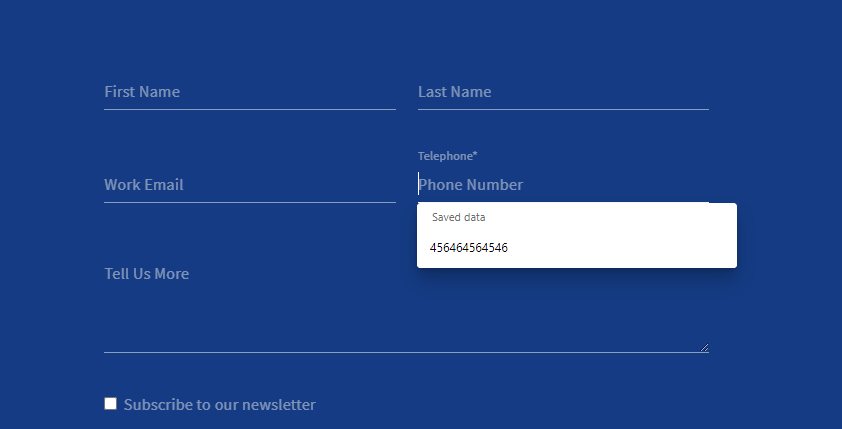
}The result can be something like below, the label is hidden, and then animates to the top. Make sure you leave enough space for that and for error messages between your form rows. This way you can have both placeholder and label, and they can be different, useful to provide additional tips to fill in the form.
